When you walk into a Chanel boutique, the silence is curated. The lighting, the white gloves, the unhurried attention. Every detail is a design decision. The question is: how do the world’s greatest luxury brands recreate that magic online, and what can every designer steal from them?
01. Slowness Is a Feature, Not a Bug
In a world obsessed with speed, luxury brands make you wait. And they make it feel like a gift. When you land on the Hermès or Louis Vuitton homepage, the experience opens like a velvet curtain: a slow cinematic video, a graceful fade-in, the logo appearing as if engraved rather than loaded.
This is a radical choice. Most UX best practices preach speed above all. But luxury UX recognises that perceived time is not measured time. A beautifully choreographed two-second reveal feels shorter, and more prestigious, than an instant flash of a cluttered grid.
The lesson isn’t “make users wait.” It’s “make every moment feel intentional.” Loading states become brand statements. Transitions become rituals. Pace communicates value before a single product is shown.
02. White Space Sells
A fast fashion website will show you 40 products on a single scroll. A luxury website shows you one. This isn’t a budget limitation. It’s a deliberate strategy rooted in the psychology of scarcity and attention.
When Louis Vuitton, Bottega Veneta, or Burberry present a single product against a near-empty canvas, they’re doing something profound: they’re saying this object deserves your full, undivided attention. The white space isn’t emptiness. It’s the digital equivalent of a velvet pedestal.
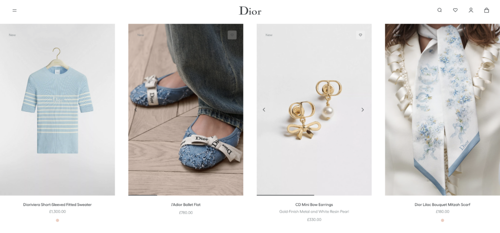
For UX designers, this means learning to resist the instinct to fill. Breathing room elevates content. Margins communicate generosity. Typography at large scale becomes sculpture. The composition communicates hierarchy without a single navigation label.
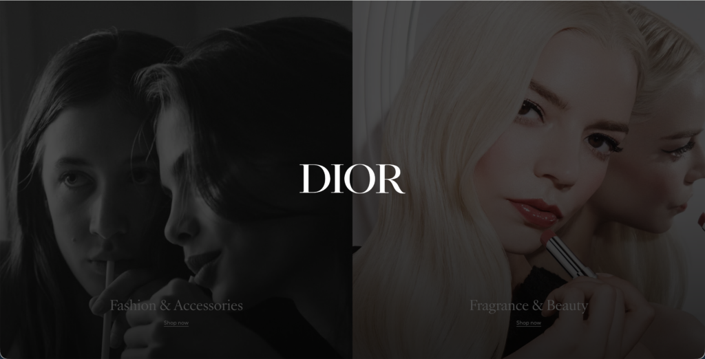
03. Typography as Identity
You recognise a Chanel page before you read a single word. The double-C is almost irrelevant. It’s the bold proprietary serif typeface, the tight tracking on all-caps labels, the elegant interplay of weight and whitespace that announces the brand instantly.
Luxury houses treat typography not as a vehicle for text, but as the first layer of visual identity. Many commission bespoke typefaces. Dior’s sharp serifs, Gucci’s retro-flavoured letterforms, Cartier’s razor-thin strokes, each is a patented personality.
The UX takeaway: type is not just for reading. It’s for feeling. Choosing a distinctive typeface and using it with discipline, consistent scales, limited weights, purposeful spacing, creates brand recognition that no logo can achieve alone.
04. Personalisation Without Intrusiveness
A good Chanel sales associate remembers your name, your last purchase, your size, and your preferred champagne. Luxury digital experiences try to recreate this without ever making it feel like surveillance.
When you return to Net-a-Porter or Mytheresa, the experience is subtly warmer. Curated edits that reflect your browsing, a wishlist that still holds your selections, a “your size” filter pre-applied. None of this is announced. It simply works, the way a great concierge simply knows.
The contrast with mainstream ecommerce is stark. Mass platforms announce every personalisation: “RECOMMENDED FOR YOU” in bold type, notifications, pop-ups, countdowns. Luxury personalisation is whispered, not shouted. It says: we know you without making you feel watched.
05. Storytelling Before Selling
Visit the Rolex website and you will not immediately see a price. You will see a diver, a mountain, a sky at dusk. You will read about the exploration of the deep ocean. You will feel something before you are asked to buy anything.
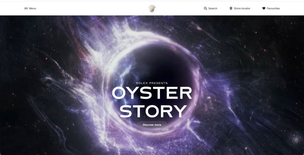
This is the storytelling-first doctrine, and it runs through every great luxury digital experience. Product pages feel like editorials. Collections launch like film premieres. The brand universe is built before the product catalogue opens.
Why does this matter for UX? Because emotional engagement precedes transactional trust. When users feel connected to a brand’s world: its values, its craft, its history… They are not comparison-shopping. They are already inside the brand. Price becomes context rather than barrier.
The lesson for every product designer: before you design the conversion flow, design the world the conversion happens inside.
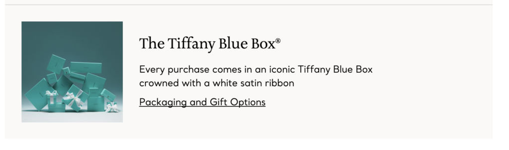
06. Frictionless After Trust Is Built
Here is the counterintuitive truth: luxury brands do not optimise for the fastest possible checkout. They optimise for a checkout that feels appropriate for the price being paid. There is a difference.
A £5,000 bag purchased in three taps feels wrong. The experience needs just enough ceremony. A confirmation of selection, a review of details, perhaps a note about delivery, to make the action feel weighty and considered. Then, and only then, is the flow as smooth as possible.
Cartier and Tiffany & Co. wrap their checkout in the same careful packaging as their physical stores. Order confirmations arrive as beautifully typeset emails, not transactional receipts. Unboxing is pre-described in the purchase flow. The ceremony extends through fulfilment.
What Every Designer Can Take Away
Luxury UX is not about exclusivity, it’s about intentionality. Every choice in a great digital experience is deliberate: the font weight, the scroll speed, the colour of a hover state. This level of attention is available to any designer willing to commit to it.
The six principles, distilled:
Design the tempo: Control the rhythm of your interface. Not every element should appear at once.
Respect the void: White space communicates confidence and directs attention without instruction.
Type as personality: A distinctive, consistently applied typeface builds recognition faster than almost any other design element.
World before product: Build emotional context through story, craft and values. Then invite users into the transaction.
Know without showing: Personalisation should feel like intuition. Surprising in its accuracy, silent in its mechanism.
Honour the moment: Key actions such as purchase, sign-up, confirmation, deserve ceremony proportional to their weight.
The greatest luxury UX lesson is this: design for how people want to feel, not just for what they need to do. The brands that have mastered this don’t have websites. They have experiences that linger.
And that, more than any framework, is what separates the memorable from the forgettable.


