ecommerce Archives - Emrise Digital

Why your product data is losing you sales

A customer emails to say the ring they ordered looks nothing like the photos. A return lands back in the warehouse. A one-star review goes up. These things hurt, but at least they are visible.

What’s harder to see is the business you lose quietly. The shopper who landed on your product page, found the description too vague to commit and went elsewhere. The product that was excluded from Google Shopping because of a data error in your feed. The item that never surfaced in an AI recommendation because it was missing the attributes the system needed to evaluate it.

Most e-commerce brands think about product data as an operational matter: something to manage, keep tidy and revisit when there is time. In practice, product data quality is a commercial variable and for many brands one of the most significant sources of preventable revenue loss.

The cost of poor product data

The clearest evidence of the commercial cost sits at the customer level.

Research from Salsify’s 2025 Consumer Research report, based on a survey of around 2,000 shoppers across the US and UK, found that 71% have returned a product because it did not match the online listing and 54% have abandoned a purchase because product content was inconsistent across channels. Research reported by Retail Times in March 2026 tells a similar story: 43% of consumers returned a product in the past year because pre-purchase information was incorrect and 68% said they would stop buying from a brand altogether after a bad product information experience. These are not isolated incidents. They are patterns of behaviour that more than half your potential customers have exhibited at some point in their buying journey.

Woman using a smartphone and credit card to shop online

For gift and jewellery brands in particular, where customers are often buying for someone else and cannot inspect the product in person, accurate and consistent product content is doing much of the work of a physical retail environment. A vague description, an inconsistent size guide or a photo that misrepresents colour or finish does not just create friction. The result is either a lost sale or a return that eats into your margins.

A return driven by inaccurate data costs twice: once in logistics and once in trust. For gift and jewellery customers, that first purchase should be the beginning of a longer relationship. Losing it to a misleading product description is entirely avoidable.

How product data affects your visibility

Beyond the customer-facing impact, product data quality has a direct bearing on whether your products are visible in the channels where purchase decisions are increasingly being made.

Google Shopping operates on the accuracy and completeness of the product feed you submit to Merchant Center. Analysis by DataFeedWatch, published by Search Engine Land in 2023, found that around 7% of all products submitted to Google Shopping are disapproved due to critical errors and that invalid Global Trade Item Numbers (GTINs), the unique numerical identifiers that Google uses to match your products to its catalogue, affect 48% of all merchants. Inadequate product data is more common than most brands realise and quietly removes products from paid and organic shopping placements. Left unresolved, it can affect the performance of your entire store.

The issue extends well beyond GTINs. Missing or incorrect product attributes, mismatched pricing, image policy violations and incomplete category data all contribute to products either being disapproved outright or performing significantly below their potential. A product that exists in your catalogue but fails to meet feed requirements will not appear in results.

Hands typing on a laptop with a data dashboard on screen

The same logic applies to AI-powered discovery. As we explored in our recent piece on AI shopping behaviour, AI recommendation systems rely heavily on structured and complete product data to evaluate, compare and surface products accurately. They do not browse visually in the way a human would, and incomplete or missing attributes make accurate assessment significantly harder. If your product feed is missing key attributes, competitors with cleaner, more complete data are more likely to be surfaced instead. The quality bar for AI visibility is higher than for traditional search because there is no human judgment to fill in the gaps.

The technical foundations that support feed quality, page speed, structured content and mobile responsiveness are the same ones that underpin strong SEO performance more broadly. Our guide to SEO web design covers those principles in more detail.

The scale of the problem

Most brands assume their product data is largely in order. The evidence suggests otherwise.

Research from Akeneo, based on a survey of 650 business leaders across the US, UK, France and Germany conducted in 2024, found that 99% of organisations face at least one product information challenge. That figure is striking not because of the scale but because of the universality. The issue is not confined to brands that have neglected their data infrastructure. It affects organisations that are actively managing their product information and still find it wanting.

For smaller and mid-sized brands without dedicated data teams, the picture is often more pronounced. Product information tends to accumulate in disconnected places: a spreadsheet here, a supplier document there, descriptions written in haste at launch and never revisited. As catalogues grow and channels multiply, the inconsistencies compound. The gap between what a brand believes its product data looks like and what is actually being read by Google’s feed validators or by an AI recommendation system is often significant.

Good data is the foundation

Product data quality is not a technical problem sitting to one side of your commercial activity. It is load-bearing. It determines whether customers trust you enough to buy, whether your products appear in shopping feeds and whether AI systems can find and recommend them.

Laptop on a desk displaying an ecommerce product listing page

In our recent piece on AI shopping and e-commerce visibility, we explored how AI agents evaluate products during the recommendation phase and how brands with structured, complete data are already at an advantage. The same foundations that improve AI visibility also improve feed performance, on-site conversion and long-term customer trust.

Most brands that look closely at their product data find more gaps than they expected. The good news is that they are fixable, and addressing them has a measurable effect on visibility, conversion and returns. That is where the work pays off.

If you’d like a clearer picture of where your data stands, get in touch.

Your Guide to Form Design (That Actually Converts)

You’ve done everything right. Your ads are running. Your traffic is solid. Your product pages look great. And yet… people keep dropping off right before they buy. Sound familiar?

Nine times out of ten, the culprit is your forms.

Checkout forms, contact forms, newsletter sign-ups… They’re some of the most visited (and most abandoned) pages in any e-commerce store.

A poorly designed form doesn’t just feel annoying to fill out. It actively costs you revenue. The good news? Form design is one of the highest-ROI fixes you can make, and you don’t need a full redesign to do it.

Here’s your no-fluff field guide to forms that get completed:

Only Ask for What You Actually Need

Let’s start with the uncomfortable truth: most forms ask for way too much information.

Every extra field you add is another micro-decision you’re asking the user to make. The moment a form feels like homework, people bail.

Go through your current forms and ask yourself: “What happens if I remove this field?” If the answer is “nothing critical,” delete it. Do you really need a phone number for a newsletter sign-up? Does your checkout form need a second address line, a fax number, or a “how did you hear about us?” dropdown?

Quick win: Removing just one or two unnecessary fields can boost completion rates by 20% or more. Start there.

One Column Is Almost Always Better Than Two

It feels intuitive to stack fields side by side to save space. First name and last name next to each other, city and postcode in a row. But research consistently shows that single-column forms are completed faster and with fewer errors than multi-column layouts.

Why? Because our eyes naturally scan top to bottom. When you introduce a second column, you’re forcing the user’s brain to recalibrate its reading path and that tiny moment of confusion adds friction.

The only exception? Short, logically paired fields like credit card expiry date and CVV, where the visual grouping actually helps the user understand the relationship between the fields.

The rule of thumb: When in doubt, go single column.

Labels Go Above the Field Always

This one sound obvious, but you’d be surprised how many e-commerce sites still use placeholder text instead of labels or put labels to the side of fields.

Here’s the problem with placeholder-only labels: the moment someone clicks into the field and starts typing, the label disappears. Now they’ve forgotten what they were supposed to write. Cue the frustration, the second-guessing, and occasionally the tab close.

Labels should live above the input field, always visible, and written in plain language. Use placeholder text only as a secondary hint (like an example format), never as a replacement for the label.

Good label: Email address Good placeholder: e.g. hello@yourname.com Bad idea: Placeholder only, no label.

Email form field with visible label and placeholder text on a dark navy background.

Write Error Messages Like a Human

Nothing kills momentum like a cold, robotic error message: “Error: Input invalid.”

Well, Thanks for nothing…

When someone makes a mistake on your form (and they will) your error message is a customer service moment. Handle it well and they’ll fix it and move on. Handle it badly and they’ll assume your whole brand is this frustrating to deal with.

Good error messages do three things:

  • Appear inline, right next to the field where the problem is (not at the top of the page in a vague red banner)
  • Tell the user what went wrong in plain language
  • Tell them how to fix it

Compare these two:

“Phone number is invalid.”  

“Looks like there’s a digit missing — UK numbers should be 11 digits long.”

One feels like a wall, the user will know something is wrong but what exactly? The other feels like help, as it’s pointing for the exact mistake and how to solve.

Make Your CTAs Earn Their Click

Your submit button is doing a lot of heavy lifting. Don’t waste it.

Generic labels like “Submit” or “Continue” tell the user nothing about what happens next. They’re vague, they feel bureaucratic, and they subtly increase anxiety, especially on checkout pages where people are about to hand over their card details.

Instead, use action-oriented language that reinforces the value the user is about to receive:

  • “Complete My Order” beats “Submit”
  • “Get My Free Guide” beats “Sign Up”
  • “Start My Free Trial” beats “Continue”

The button should also be impossible to miss. High contrast, full width on mobile, and placed where the user’s eye naturally lands after filling the last field. Don’t make them hunt for it.

Show Progress on Multi-Step Forms

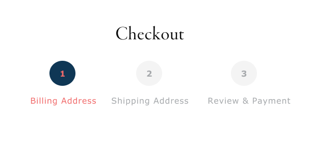
If your checkout process is more than one step (and for most e-commerce stores, it is), a progress indicator is non-negotiable.

Humans are goal-oriented. We’re far more likely to finish something when we can see how close we are to the end. A simple “Step 2 of 3” or a visual progress bar gives users that sense of forward momentum — and dramatically reduces abandonment mid-flow.

Keep each step focused on one category of information (personal details, shipping, payment) and avoid dumping everything onto one overwhelming screen.

Bonus tip: Lead with the easiest fields first. Email and name before card details. Once someone has invested a couple of minutes filling out a form, they’re much more likely to finish it.

Three-step checkout progress indicator showing Billing Address, Shipping Address, and Review & Payment, with step one active.

Design for Mobile First and then Desktop

Over 70% of e-commerce traffic now comes from mobile devices. But most checkout forms were designed for a desktop experience and then awkwardly squeezed onto a small screen.

Here’s what good mobile form design looks like in practice:

  • Tap targets (buttons and input fields) are at least 44x44px — large enough to hit without zooming in
  • The correct keyboard type is triggered automatically (numeric for phone/card fields, email keyboard for email fields)
  • Fields are spaced so your thumb doesn’t accidentally tap the wrong one
  • Autofill is enabled so returning users can breeze through

If you’ve never tested your own checkout form on a real phone, do it right now. You’ll probably find at least three things to fix immediately.

The Bottom Line

Great form design isn’t about making things look pretty. It’s about removing every possible reason for someone to give up. Every unnecessary field, every confusing label, every robotic error message is a tiny leak in your conversion funnel.

The good news is that most of these fixes are quick to implement and fast to show results. You don’t need a new platform or a six-month redesign project. You need to look at your forms with honest, critical eyes.

Start with your checkout form. Fix the obvious friction points. Test, measure, and iterate.

Your future customers will thank you by actually completing their purchase.

Want us to audit your current forms and find out where you’re losing conversions? Get in touch we’d love to take a look.

Your customers are using AI to shop. Is your store ready?

Most e-commerce brands are still optimising for a customer journey that fewer and fewer people are actually taking. The assumption of browse, search, compare, click, buy made sense for a long time. That is changing, and faster than most brands have accounted for.

A growing share of your customers are now starting that process somewhere else entirely: inside an AI. They’re asking ChatGPT what to buy for a wedding anniversary, letting Perplexity compare luxury candles and asking Gemini to find the best-reviewed gifts under £100. For most shoppers today, AI is still playing an advisory role. It surfaces options, compares products and shortlists choices before the customer makes the final decision. But the share of that decision-making happening inside AI tools, rather than on your store, is growing fast.

This isn’t a prediction. It’s already happening, and most brands have two significant blind spots at once.

The discovery problem

AI shopping agents don’t browse the way humans do. They don’t scroll category pages or respond to homepage banners. They pull structured data, parse product feeds and make decisions based on what they can actually read and verify. If your product information is incomplete, inconsistent or missing key attributes, agents may not flag it. They move on, and your competitor gets surfaced instead.

The scale of this shift is already showing up in traffic data. AI-referred traffic to retail sites grew 693.4% across the 2025 holiday season, according to Adobe Analytics, though it’s worth noting this is from a low base. eMarketer forecasts AI platforms will drive $144 billion in e-commerce sales by 2029, nearly 9% of all US retail e-commerce. eMarketer also projects that 20% of all online transactions could be initiated by AI agents by the end of this year, a figure echoed by Gartner, though “initiated” covers a wide range of behaviour, from an AI recommendation that leads to a click through to fully autonomous purchasing, which remains rare.

A joint study by IBM’s Institute for Business Value and the National Retail Federation, surveying 18,000 consumers across 23 countries, found that 45% are already using AI somewhere in their buying journey. Adyen’s 2026 UK Retail Report found that 44% of UK shoppers are now open to having AI handle the entire shopping process, including the final purchase, once their preferences and budget are set. This is a shift still in progress, but the direction is clear.

A meaningful and fast-growing portion of your addressable market is making purchase decisions in an environment where your product content needs to work harder than ever.

The brands currently performing well in these environments aren’t necessarily the biggest or the best-known. They’re the ones whose data is structured, complete and consistently maintained across every feed and platform. Missing dimensions, vague product descriptions, absent review data and unstructured specifications are no longer just bad for traditional SEO. As AI search becomes a more significant part of how products are found and evaluated, the stakes attached to data quality have risen considerably.

Maintaining that consistency across feeds, platforms and a constantly changing product catalogue is demanding but increasingly essential.

Person browsing ecommerce products on a laptop.

The experience problem

The expectations of customers who still land directly on your store are also shifting.

People who regularly use AI tools in their daily lives, for research, for recommendations, for planning, are increasingly accustomed to experiences that feel relevant to them specifically. Not just “personalised” in the sense of a name in an email subject line, but genuinely tailored. Recommendations that reflect their actual preferences, interfaces that surface what they’re likely to want before they go looking for it.

When those customers arrive on an e-commerce site that doesn’t match that experience, the gap is noticeable. According to Adobe Analytics, visitors referred from AI platforms convert at a rate 31% higher than average and generate 254% more revenue per visit, suggesting that when the experience matches the expectation AI has already set, shoppers are significantly more ready to buy. Customers who don’t get that experience are increasingly likely to leave without converting, having been conditioned by AI-assisted experiences to expect something better.

This isn’t a feature problem. It’s a foundations problem.

Brands that are getting this right aren’t deploying one big solution. They know what a returning customer looks like, and they can adjust what products are shown and in what order.

Woman with a book using a mobile phone for research.

The visibility gap

What makes this difficult is that the signals don’t always show up where you’d expect them to. AI referral traffic, Google AI Overviews and brand visibility across recommendation platforms are increasingly trackable, but the picture is rarely complete, and interpreting it requires a different kind of attention than reading a standard analytics dashboard.

The earlier part of the funnel is harder still. When AI tools evaluate products during the recommendation phase, that process doesn’t show up in your usual reports. The gap tends to surface indirectly, in conversion rates that don’t quite add up or revenue that’s hard to account for directly.

As McKinsey notes, most brands are still running personalisation efforts as manual, one-off experiments rather than measuring them in any integrated way, which means the effect often gets absorbed into overall performance numbers without a clear cause.

What ties all of this together is the quality of the foundations underneath. Structured product data, clean feeds, solid SEO and proper analytics infrastructure are what influence visibility in AI search and traditional search alike. The brands least likely to face these problems are those who’ve already got that groundwork in place.

These things compound over time. AI systems learn which products and brands to surface based on data quality and engagement signals. Stores that aren’t visible or competitive in AI-referred channels today will become progressively less so. The window to build the right foundations is narrowing.

It is also where the right expertise makes the most difference.

AI hasn’t changed what good e-commerce looks like at its core: relevant products, trustworthy information, a smooth path to purchase.

Emrise works with e-commerce brands on the foundations that influence both search visibility and AI recommendation, from structured product data and technical SEO to analytics and measurement. Get in touch to find out where your store stands.