The Rise and Fall of Follower Count
Why Influence Doesn’t Mean Numbers Anymore.
Remember When Followers Actually Mattered?
There was a time when the answer was straightforward: if you had followers, people saw your content. If you built a large audience, your reach was guaranteed. Follower count was the internet’s primary currency of influence, and for good reason—it directly determined whether your content would be distributed or overlooked.
Brands made decisions based on it. Creators celebrated milestones around it. Platforms made it the most visible metric on every profile. For nearly a decade, follower count was the primary measure of online success—the definitive signal of popularity and reach.
But here’s the truth: that era has quietly ended.
What Has Changed?
The shift wasn’t sudden or obvious. It happened gradually as social platforms moved away from follower-based distribution toward algorithmic systems. And today, that change is complete enough that the old rules no longer apply.
The Washington Post found that users only see videos from creators they follow about 10% of the time. On Instagram and TikTok, the majority of what appears in your feed comes from accounts you don’t follow. Your content doesn’t appear because someone subscribed to you—it appears because an algorithm predicted you’d engage with it.
The Reality: Your follower count no longer determines your reach. Distribution is now driven by algorithmic predictions about engagement, not by audience size. This fundamental shift means that a creator with 10,000 highly engaged followers might reach more people than a creator with 100,000 passive ones.
This wasn’t a subtle change. It was a complete architectural overhaul of how content moves online. And yet, many creators and brands are still operating as if follower count is the primary metric that matters.

What Actually Signals Real Influence Now?
- If follower count has lost its value as a proxy for influence, what has replaced it? The answer is more nuanced—and frankly, harder to manipulate.
- True influence in 2024 looks like:
- Content that carries beyond the platform. Your ideas appear in group chats, get referenced in conversations, and show up in real life. They are not just liked and forgotten—they are talked about and shared outside the algorithmic bubble.
- Audience recognition and repeat engagement. People recognise you over time. They return for your next post, your next video, your next update. They are not passive scrollers; they are followers in the truest sense—people who actively choose to keep up with what you create.
- Differentiation, not trends. Influence comes from building something distinctive that only you can do, not from posting the same trend a million other creators are also posting. The creators with real cultural weight are the ones setting trends, not chasing them.
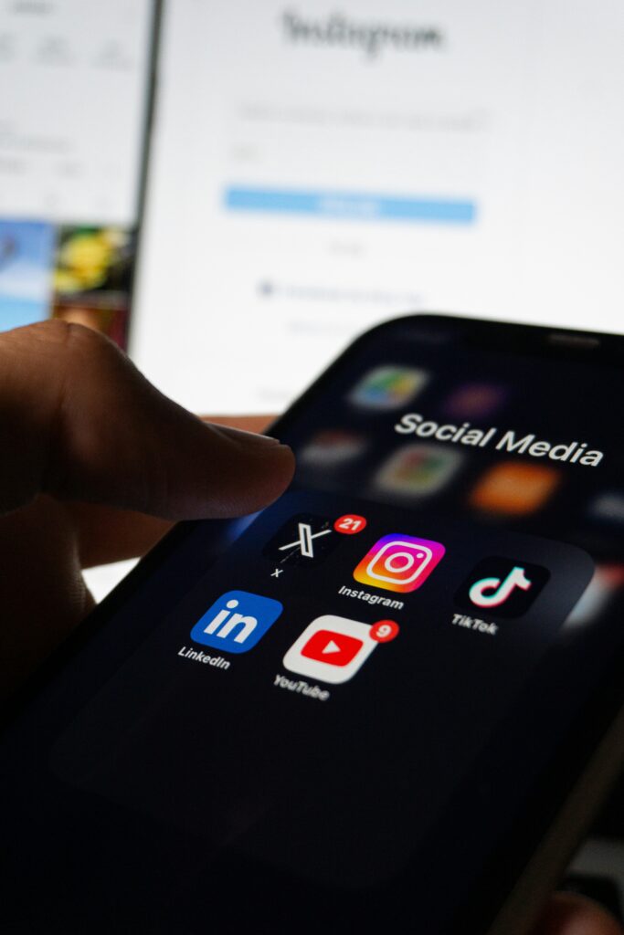
- Multi-platform presence. Having a presence only on one social platform is increasingly risky. Real influence is built across multiple channels—newsletters, YouTube, broadcast platforms, even offline communities. This diversification protects you from algorithm changes and platform shifts.
Why This Matters for Your Content Strategy
If you’re still optimising primarily for follower growth, you might be spending effort on a vanity metric that no longer drives real results. This does not mean followers are useless—they still matter for credibility and potential reach. But they have moved from being a primary lever to being a secondary one.
The brands and creators winning right now are the ones who have already made this mental shift. They are focused on:
- Creating content with lasting value and cultural resonance, not just achieving views
- Building deeper relationships with their audience rather than scaling to the largest possible audience
- Measuring success by engagement depth, audience return rate, and real-world impact, not just follower milestones
- Diversifying where their influence lives, not relying on a single platform
The Uncomfortable Truth
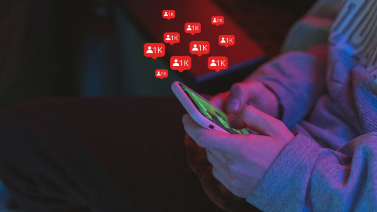
The follower count model worked for platforms because it was simple, visible, and gamifiable. It made influencer marketing straightforward: more followers = higher rates. More followers = more authority.
But it also created significant fake growth. Followers purchased from services that do not convert. Engagement from accounts that do not exist. A massive industry built on inflating a number that stopped meaning what everyone thought it meant.
The new paradigm is messier. It is harder to fake. It requires actually building something people care about, not just collecting followers like points in a game.
Followers Still Matter—Just Not How You Might Think
To be clear: this is not a call to ignore your follower count. Followers still indicate credibility. A larger audience still creates more opportunities for algorithmic visibility. Growing your followers is still valuable.
But they no longer define influence. And that shift is already playing out in how content actually moves, what gets carried forward, and who holds real cultural weight.
The sooner you align your strategy with this reality, the sooner you can focus on building something that actually lasts—something people come back to, talk about, and keep in their lives. That’s influence. That’s what matters now.
Rethinking Your Influence Strategy?
The shift from follower-count thinking to cultural-impact thinking changes how you should approach content strategy, audience building, and measuring success.
Let’s talk about what this means for your brand or creator business.
At Emrise, we help brands navigate the creator economy with data-driven strategies, performance tracking, and partnerships that actually convert. Get in touch with the Emrise team at [email protected] or call 0115 678 7377 and we’ll build a plan that works for your market and your team.