You’ve done everything right. Your ads are running. Your traffic is solid. Your product pages look great. And yet… people keep dropping off right before they buy. Sound familiar?
Nine times out of ten, the culprit is your forms.
Checkout forms, contact forms, newsletter sign-ups… They’re some of the most visited (and most abandoned) pages in any e-commerce store.
A poorly designed form doesn’t just feel annoying to fill out. It actively costs you revenue. The good news? Form design is one of the highest-ROI fixes you can make, and you don’t need a full redesign to do it.
Here’s your no-fluff field guide to forms that get completed:
Only Ask for What You Actually Need
Let’s start with the uncomfortable truth: most forms ask for way too much information.
Every extra field you add is another micro-decision you’re asking the user to make. The moment a form feels like homework, people bail.
Go through your current forms and ask yourself: “What happens if I remove this field?” If the answer is “nothing critical,” delete it. Do you really need a phone number for a newsletter sign-up? Does your checkout form need a second address line, a fax number, or a “how did you hear about us?” dropdown?
Quick win: Removing just one or two unnecessary fields can boost completion rates by 20% or more. Start there.
One Column Is Almost Always Better Than Two
It feels intuitive to stack fields side by side to save space. First name and last name next to each other, city and postcode in a row. But research consistently shows that single-column forms are completed faster and with fewer errors than multi-column layouts.
Why? Because our eyes naturally scan top to bottom. When you introduce a second column, you’re forcing the user’s brain to recalibrate its reading path and that tiny moment of confusion adds friction.
The only exception? Short, logically paired fields like credit card expiry date and CVV, where the visual grouping actually helps the user understand the relationship between the fields.
The rule of thumb: When in doubt, go single column.
Labels Go Above the Field Always
This one sound obvious, but you’d be surprised how many e-commerce sites still use placeholder text instead of labels or put labels to the side of fields.
Here’s the problem with placeholder-only labels: the moment someone clicks into the field and starts typing, the label disappears. Now they’ve forgotten what they were supposed to write. Cue the frustration, the second-guessing, and occasionally the tab close.
Labels should live above the input field, always visible, and written in plain language. Use placeholder text only as a secondary hint (like an example format), never as a replacement for the label.
Good label: Email address Good placeholder: e.g. [email protected] Bad idea: Placeholder only, no label.

Write Error Messages Like a Human
Nothing kills momentum like a cold, robotic error message: “Error: Input invalid.”
Well, Thanks for nothing…
When someone makes a mistake on your form (and they will) your error message is a customer service moment. Handle it well and they’ll fix it and move on. Handle it badly and they’ll assume your whole brand is this frustrating to deal with.
Good error messages do three things:
- Appear inline, right next to the field where the problem is (not at the top of the page in a vague red banner)
- Tell the user what went wrong in plain language
- Tell them how to fix it
Compare these two:
“Phone number is invalid.”
“Looks like there’s a digit missing — UK numbers should be 11 digits long.”
One feels like a wall, the user will know something is wrong but what exactly? The other feels like help, as it’s pointing for the exact mistake and how to solve.
Make Your CTAs Earn Their Click
Your submit button is doing a lot of heavy lifting. Don’t waste it.
Generic labels like “Submit” or “Continue” tell the user nothing about what happens next. They’re vague, they feel bureaucratic, and they subtly increase anxiety, especially on checkout pages where people are about to hand over their card details.
Instead, use action-oriented language that reinforces the value the user is about to receive:
- “Complete My Order” beats “Submit”
- “Get My Free Guide” beats “Sign Up”
- “Start My Free Trial” beats “Continue”
The button should also be impossible to miss. High contrast, full width on mobile, and placed where the user’s eye naturally lands after filling the last field. Don’t make them hunt for it.
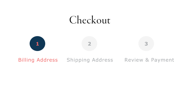
Show Progress on Multi-Step Forms
If your checkout process is more than one step (and for most e-commerce stores, it is), a progress indicator is non-negotiable.
Humans are goal-oriented. We’re far more likely to finish something when we can see how close we are to the end. A simple “Step 2 of 3” or a visual progress bar gives users that sense of forward momentum — and dramatically reduces abandonment mid-flow.
Keep each step focused on one category of information (personal details, shipping, payment) and avoid dumping everything onto one overwhelming screen.
Bonus tip: Lead with the easiest fields first. Email and name before card details. Once someone has invested a couple of minutes filling out a form, they’re much more likely to finish it.
Design for Mobile First and then Desktop
Over 70% of e-commerce traffic now comes from mobile devices. But most checkout forms were designed for a desktop experience and then awkwardly squeezed onto a small screen.
Here’s what good mobile form design looks like in practice:
- Tap targets (buttons and input fields) are at least 44x44px — large enough to hit without zooming in
- The correct keyboard type is triggered automatically (numeric for phone/card fields, email keyboard for email fields)
- Fields are spaced so your thumb doesn’t accidentally tap the wrong one
- Autofill is enabled so returning users can breeze through
If you’ve never tested your own checkout form on a real phone, do it right now. You’ll probably find at least three things to fix immediately.
The Bottom Line
Great form design isn’t about making things look pretty. It’s about removing every possible reason for someone to give up. Every unnecessary field, every confusing label, every robotic error message is a tiny leak in your conversion funnel.
The good news is that most of these fixes are quick to implement and fast to show results. You don’t need a new platform or a six-month redesign project. You need to look at your forms with honest, critical eyes.
Start with your checkout form. Fix the obvious friction points. Test, measure, and iterate.
Your future customers will thank you by actually completing their purchase.
Want us to audit your current forms and find out where you’re losing conversions? Get in touch we’d love to take a look.


